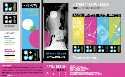
Last night at the Hamiltonian Gallery, the Arts District Branding Committee unveiled the latest round of designs for the street banners that will hang throughout the neighborhood. The designs unveiled last night are based off of the feedback received at last weeks meeting, when the original design ideas were unveiled.
As the DC Arts District blog states, "Five original graphic designs illustrate the vibrancy of the Arts District. Four strong, bold colors create the color palette. Each logo banner is topped by a "buzz word" that is descriptive of this Arts District."
The designs are included below, but first some context. The Committee raised several points regarding the "whys" of the designs previewed last night, including:
* We now have a slogan: "It's more than art"
* There was strong pushback from individuals and groups, including the residents of the Shaw neighborhood and councilmember Jim Graham, regarding the use of the term "Mid-City" in the name of the arts district. Reasons cited included the lack of a strong geographic identity conveyed by the term and potential confusion with other existing "mid-city" groups, such as the Mid City Business Association and Mid-City Artists.
* There was also overwhelming feedback that the names of the district's three core neighborhoods--Shaw, Logan and U Street--be incorporated into the branding.
* The Committee has finalized potential names for the district: the U Street/Shaw/Logan Arts District, or the U Street/Shaw/Logan Arts + Design District.
* Each "designed" panel will appear alongside a panel consisting of art provided by area artists, including photographs, sketches, paintings and other visual mediums. The "designed" panel will always appear on the "street" side, whereas the artist panel will appear on the sidewalk side.
* There was a conscientious effort to include "DC" imagery in at least some of the banners--you'll note in the images below the use of the District outline and Logan/Shaw streetgrid, replete with traffic circles. The circles, in fact, show up several times throughout the banners.
The banners that were presented last night ca be found below. What do you think--will they contribute to the ongoing development of the neighborhood? Do you like the design? More information about each, as well as updated status on the project--which is set for a public unveiling throughout the neighborhood in early December--can be found at the DC Arts District blog.
1. DC Arts District 
2. Arts + Design District
3. DC Arts District ( generic)
4. 4 in 1 montage
Tuesday, November 9, 2010
Arts District Branding Initiative: Update on Banner Designs
Posted by
Mr. Other Upper NW
at
8:01 PM
![]()
Labels: 14th Street, art, dc arts district, midcity arts district, U street
Subscribe to:
Post Comments (Atom)
8 comments:
not really blown away by any of the designs.
what i'm really blown away by is the fact that we've blown $200,000 in Neighborhood Improvement Fund grants to design a banner program, with no plans on how to sustain or pay for it after the grant monies run out.
imagine what real and substantial changes we could have done in our neighborhood with $200,000: a new playground for Harrison Recreation Center, streetscape improvements, grants for public safety and quality of life programs, the list almost writes itself.
Sorry. Too, boring. Branding experts? I don't think so. Please reconsider this boondoggle while there's still time.
Kendall, the money for this project has already been committed and much of it already spent. The time to "reconsider" this initiative has long since passed. If you're unhappy with the designs, you can register your thoughts through the project's website. Also, there have been two public meetings held which you could have attended and where these designs were shown and discussed. As I was in attendance, I can tell you that the comments received from the public were taken recorded and are being considered.
These banners are absolutely hideous. They look like bad day glo posters that you would find in a head shop circa 1973. I would be embarrassed to have these hang in my neighborhood.
I agree with the other commenters that this undertaking is a huge waste of taxpayer money.
Is there are bigger word than huge?
Until I can think of one I'll just agree..."HUGE waste of money".
"Mid City" is soooooo much better than "U Street/Shaw/Logan"!
I went to the meetings. Which suggestions, if any, were implemented? Now we're living with the banners, which look pathetic. Could you please post how the $200000 was spent, please?
Anon: the Arts District budget is posted on their website--you can go there to see how the funds were allocated. http://www.dcartsdistrict.org/brandbudget.pdf
Post a Comment